Why road signs look the way they do
Shapes, colours, mixed-case letters and generous spacing: the design choices that let you read a sign in a second.

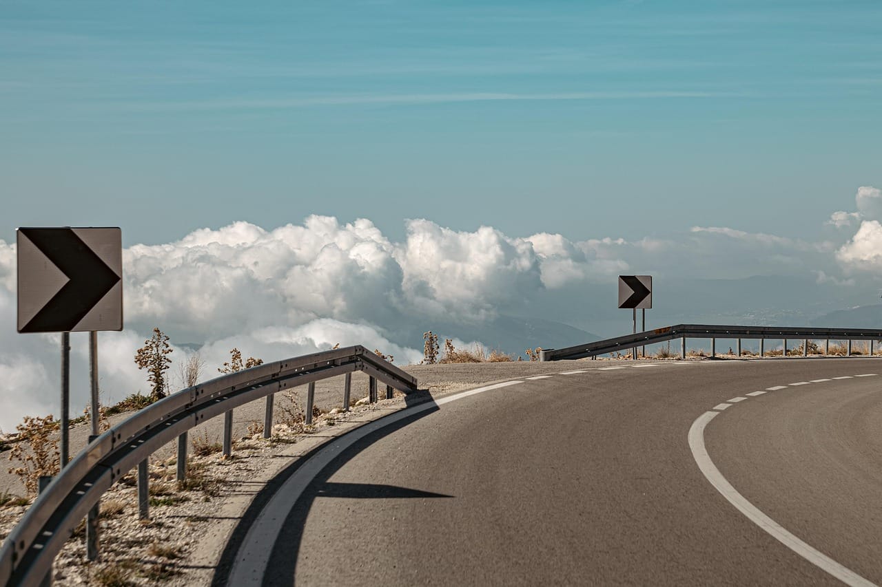
You read hundreds of road signs a week and probably never think about them. That is the point. A good road sign is designed to be understood in about a second, from a moving car, at night, in the rain, by someone who is tired, stressed or reading in their second language. Almost every detail of how they look comes from that one job.
Shape and colour come first
Before you can read a sign, you recognise it. Shape and colour do that work. In much of the world, triangles warn, circles order and rectangles inform. Red usually means stop or do not, blue gives instructions and green, blue or brown direction signs tell you where you are going.
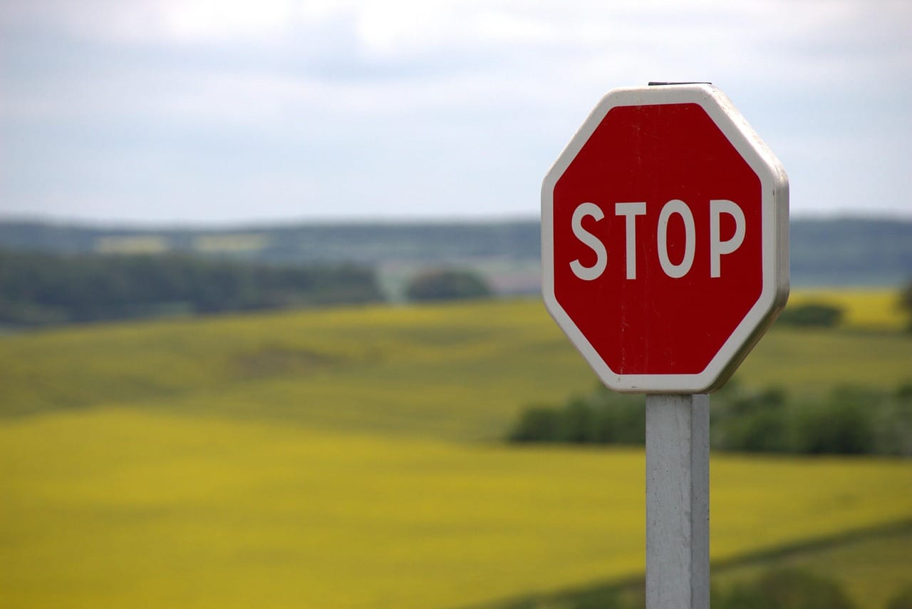
The stop sign is the famous exception: an octagon, a shape used for nothing else, so it can be recognised even from behind or when covered in snow. Designers call this redundancy. A sign should still work if one of its features fails.
Why the letters look friendly
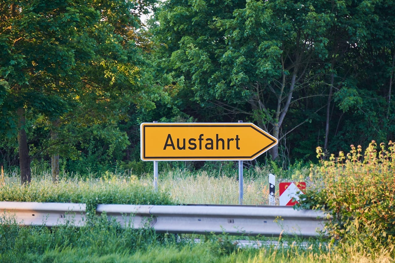
Look closely at the lettering on British or many European direction signs and you notice it is not plain capitals. Place names are written in lower case with a capital first letter. That choice came from testing in the late 1950s and 1960s, when designers Jock Kinneir and Margaret Calvert created the lettering and system for Britain's new motorways and roads.
A word in lower case has a shape. A word in capitals is a rectangle.
Leo Marchetti
Lower-case words have ascenders and descenders, the parts that go above and below the line, which give each word a distinctive outline. Drivers recognise that outline before they can read every letter. The typeface itself, called Transport, has open, rounded shapes so that letters do not fill in when seen from far away or through glare.
Spacing is everything
The space around letters matters as much as the letters themselves. Road sign alphabets use generous letter spacing so that letters do not blur together at distance or at night, when headlights make the reflective surface glow. The size of the letters is set by the speed of the road: the faster the traffic, the bigger the text, so that drivers have time to read it.
That is also why signs carry so little. Designers try to limit each sign to a few destinations. Every extra line of text adds reading time, and at motorway speed, reading time is distance travelled without looking at the road.
Night, rain and reflection
Most road signs are covered with retroreflective sheeting, which sends headlight beams back towards the driver. It makes the sign glow at night without any lights of its own. Different grades of sheeting reflect more or less light, and busy, fast roads get the brightest.
| Feature | Why |
|---|---|
| Mixed-case place names | Word shapes are recognised faster |
| Wide letter spacing | Letters stay separate at distance and at night |
| Standard shapes | Recognised before the text is read |
| Reflective sheeting | Visible in headlights with no power |
When signs go wrong
Bad signs are usually the result of adding things: extra destinations, extra warnings, extra signs on the same pole. Clutter makes each sign harder to find and slows everyone down. Many road authorities now run "de-cluttering" projects to remove signs that are no longer needed.
The best road signs are the ones you never notice. You glance, understand and move on, which is exactly what their designers intended.
Designing for everyone
Road signs have to work for all drivers, including older drivers whose eyesight is less sharp, drivers with colour blindness and visitors from abroad. That is why sign systems rely on shape as well as colour, and why the contrast between letters and background is so high. It is also why many countries have agreed common designs through international conventions, so that a driver from one country can understand the signs in another.
Pictograms help too. A symbol of a petrol pump, a bed or a plane is understood almost everywhere, whatever language the driver speaks.